From its title, you could be misled into dismissing this show as narrow and self-referential: a small exhibition in a small gallery curated by a Belgian artist concerned only with his own countrymen. In fact, it is something of a survey, featuring works with influences that range from Piet Mondrian, Ad Reinhardt and Lucio Fontana, to the Color Field painters. Its considerable reach gains focus through the prism of its curator; Luc Tuymans’ own uneasy commitment to the figurative sets up a productive tension with the works he has selected, and with the many and conflicting ideas, subtly alluded to, that have shaped abstract art over the course of a century or so.
For all its breadth, each of the 40 or so works on display has been made by a Belgian artist, a distinction that demands we consider the 15 artists here, who span two generations – the gap – in light of the prodigious artistic output of that country. Boy & Erik Stappaerts (1969–) invokes his Flemish ancestry rather clumsily in his Polarisation Paintings, 2014–15 (pictured below right: Polarisation painting, 2015), reducing what he perceives as the predominant colours of the Old Masters to discrete panels representing blue sky, red draperies, and cool and warm skin tones. The uniformly rippled effect achieved by spray painting aluminium with car lacquers mimics the look of oil glazes, while ridding them of their painterly expression. It’s a blunt instrument, and his method of abstracting a figurative mode of painting seems only to belittle it: certainly, it’s hard to imagine anyone reading it as a homage. Similarly, Gert Robijns’ (1972–) exquisitely detailed Brussels Sprout, 2012, cast in bronze and positioned on a plinth, hovers somewhere between tribute and ridicule.
 If the faithful representation of material reality was a preoccupation of Flemish painters from the 15th to the 17th centuries, the physicality of things is a concern shared with abstract art. Pieter Vermeersch, (1973–), one of the younger generation of artists here, responds to ideas explored by artists like Piet Mondrian and Ad Reinhardt, both acknowledged influences on Tuymans himself, by testing the very nature of painting itself. Vermeesch’s soft gradations of oil paint mimic the polished, reflective surface of a bare metal sheet, the painted surface appearing to be at once support and subject, utterly self-contained.
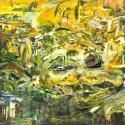
Similarly, the primary colours Vermeersch has applied to a piece of polished marble surely amount to a commentary on the failure of painting: instead of forming a legible picture plane, his marks are disengaged from their support, confusing and impeding our view. The relationship between paint and ground is disrupted, and put into a sort of limbo (Pictured below left: Untitled, 2014).
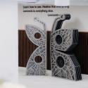
Such tensions resonate throughout this show and culminate in a column of double-sided mirrors dominating the centre of the second room, continuing up through the floor, treelike, to the upper gallery. Made by Carla Arocha & Stéphane Schraenen (1961– and 1971–), the piece simultaneously frames and reflects, partially and imperfectly, the red, yellow and blue of surrounding works (Main picture). As you move around it the view changes like a kaleidoscope, the space condensing and flattening to generate an interplay of presence and absence, positive and negative, real and unreal.
As the column seems to re-emerge in the upstairs gallery, the vivid primary colours are replaced by the colours of night: black, cool blue and a deep burgundy. In this way we are constantly drawn back to Tuymans’ own territory, the representational.
 For all the tensions and dialogues that Tuymans initiates in his selection and arrangement of works, it is his artist’s eye that prevails, producing a wonderfully good-looking show that is, nevertheless, probably greater than the sum of its parts.
In the downstairs gallery Tuymans’ refreshingly visual approach – by no means a given amongst today’s curators – gives rise to beautiful juxtapositions that propose intelligent and thought-provoking insights into the nature of colour and monochrome.
Upstairs however, his undoubted knack for colour co-ordination starts to look a little like interior decoration, those dusky colours and the chandelier-like mirrors of Arocha & Schraenen’s column offputtingly reminiscent of a swanky hotel lobby. But as abstract art remains unwaveringly popular in the world’s boardrooms and corporate spaces, it seems somehow fitting to point out its capacity to be easy on the eye, blandly inoffensive, all things to all people. If this is Tuymans’ parting shot, then it is elegantly done, presenting us with one of the recurring dilemmas of abstraction: is it enough for art to exist for itself, to have beauty as its principal aim?